Building Upon a 200 Year-Old Legacy
A responsive website redesign for a church with a 200 year-old legacy. Cornerstone was seeking to improve their web presence and build a platform that allowed them to produce content that spoke to spiritual and life issues faced by the communities in West Los Angeles. I sought to develop a content–focused and image–driven responsive website system that could grow as their content needs changed over the coming years. With a mobile-first emphasis we structured the hierarchy of content for the mobile device first and then scaled up to larger breakpoints as we worked through the design process. For the sake of brevity 960px breakpoint designs are displayed below with various responsive layouts highlighted throughout.
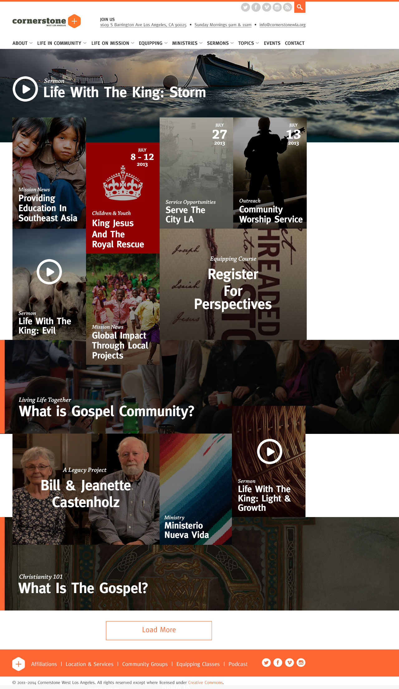
I wanted to play on the concept of a “cornerstone” by anchoring all content to the left side of the browser and developing a staggered layout system that allowed for content items to build upon themselves.
Section Landing Template
Site content is divided into 7 major sections: “Introduction to Cornerstone”, “What is Gospel Community?”, “What is Gospel Mission?”, “Why Equipping?”, “Why Ministries?”, Topics, and Events. Users are guided to these section landing pages to provide an overview of sub-content. Every piece of content on the website is associated with 3 topics and related content based on assigned topics are displayed at the bottom of template. You’ll notice the related content section borrows the staggered grid system from the home page.
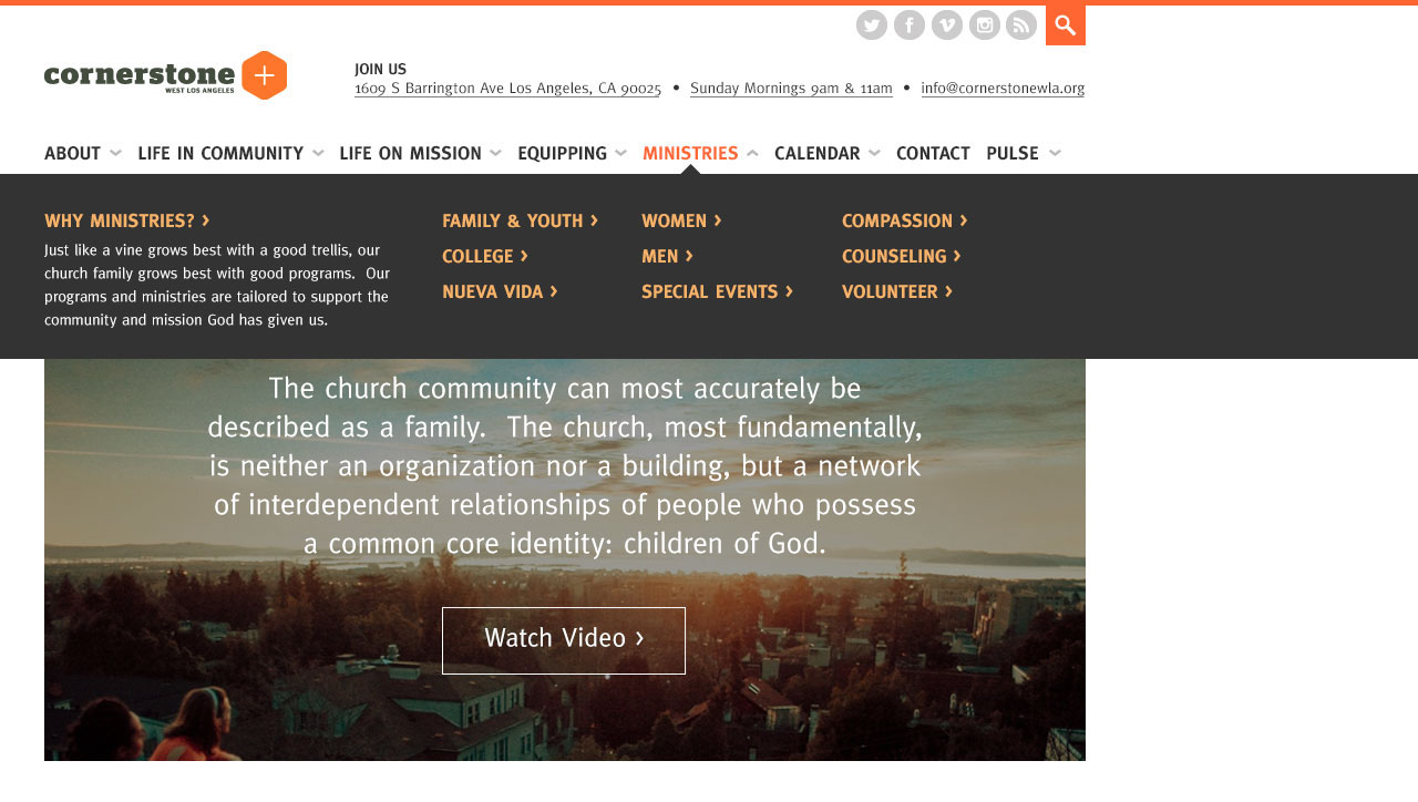
720 – 1280 Breakpoint Navigation
320 Navigation

Detail Page Template
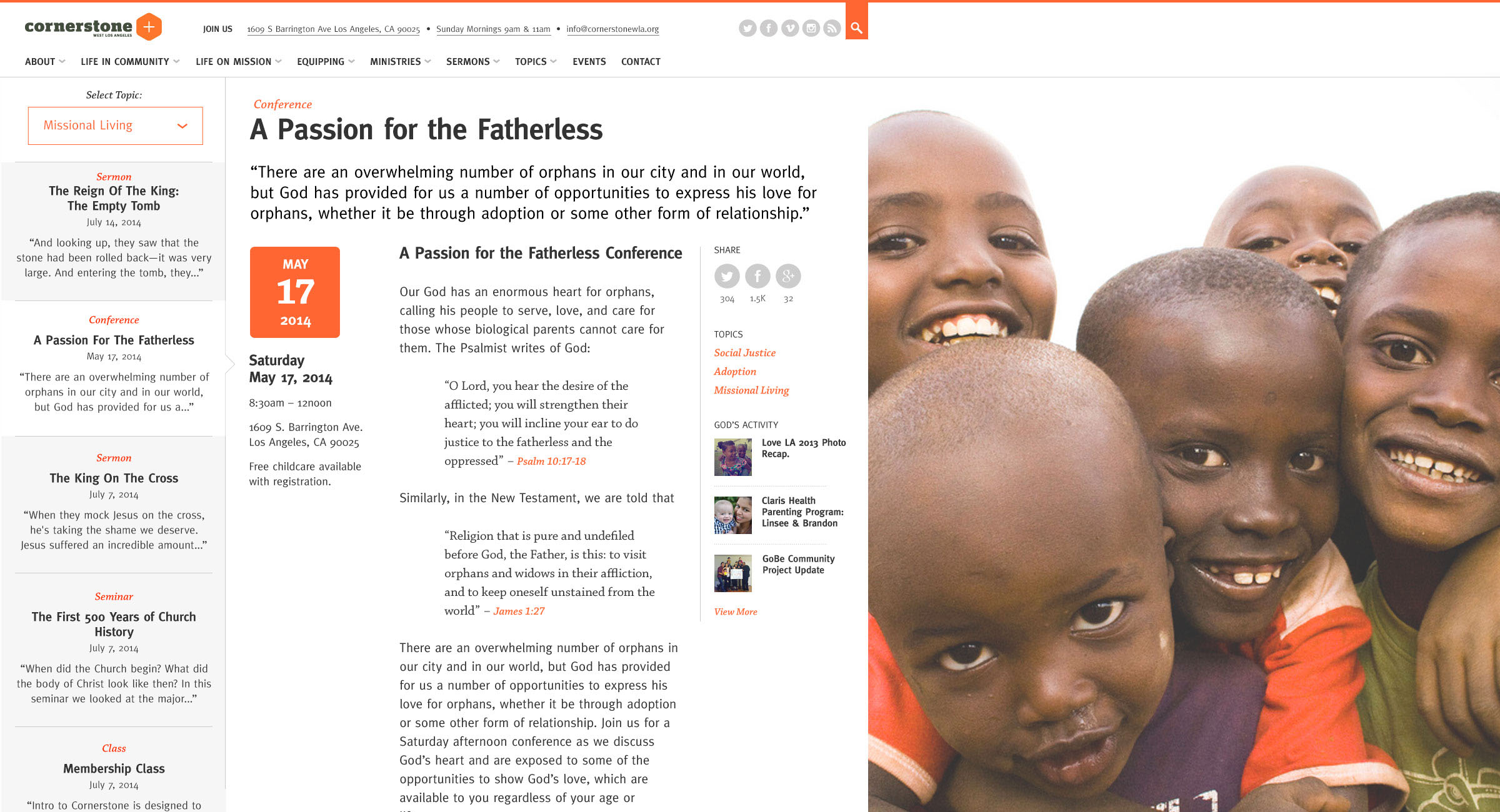
We designed the detail page template to be the most flexible of the template set. With minimal CMS administration content modules could be added to the default detail page template to accommodate 2-column grids, 4-column grids, stacked content layouts, and adaptive layouts based on date & time. Below is an example of an upcoming conference event providing registration and session details. Once the conference had passed this page could easily be repurposed as an archive of the event with audio downloads of sessions, replacing the date with an inspirational quote, and removing event specific content like childcare and directions information.

Topics Template
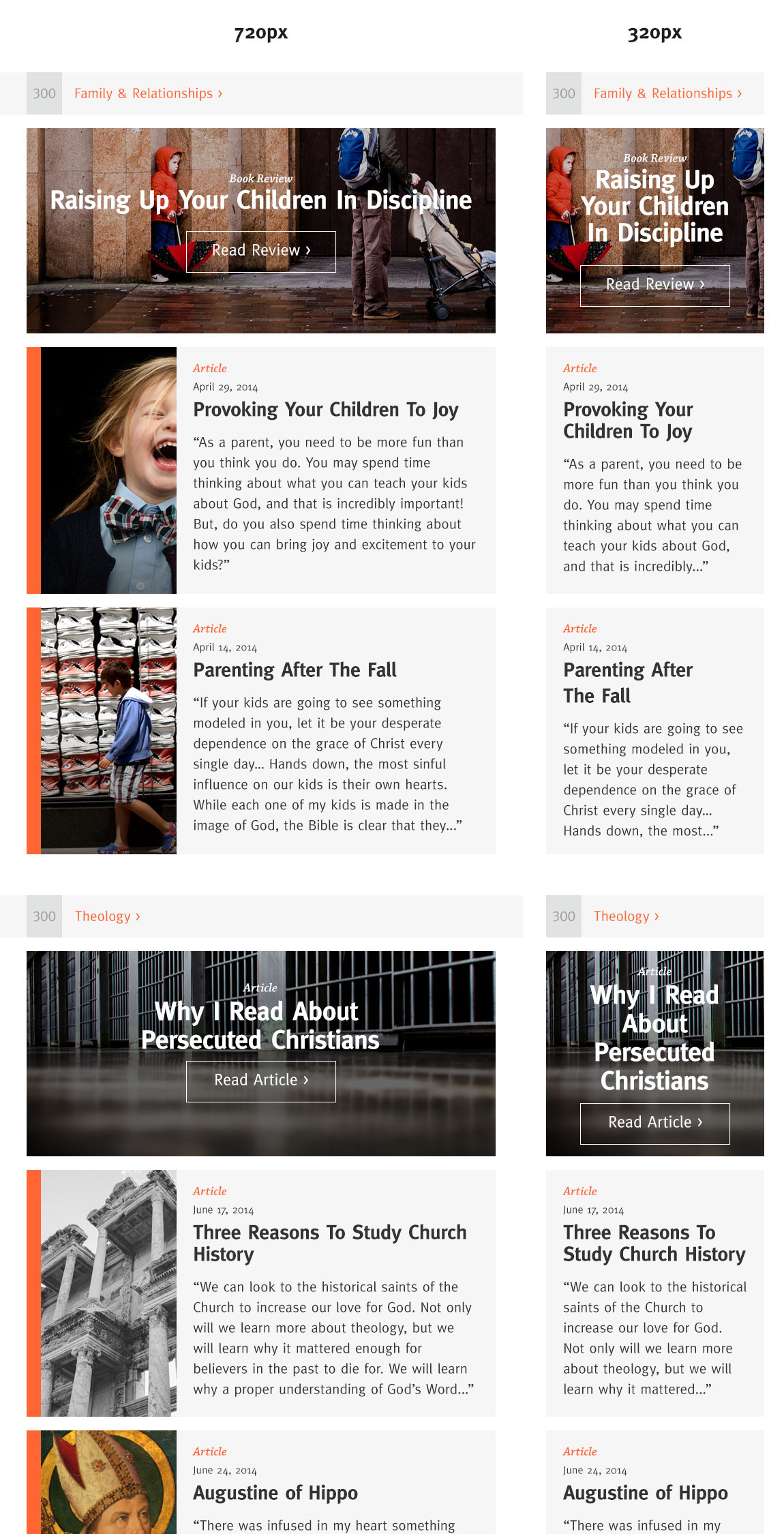
All content is organized by a two-level topic categorization system. Top-level topic categories are displayed sequentially by date based on which topic category has the most recent contribution. This was implemented to allow for the topics section to be dynamically populated based on most recent entries, but still allow access to previously posted content. Essentially the average user will never see the same set of content more than once.
A preview of content within the topic category displays a “featured” content item as well as the two most recent content contributions listed in sequential order.
Users can drill down to sub-level topic sets or individual sub-level topic content items ultimately leading to the detail page template.
Responsive layout breakpoints are highlighted below.
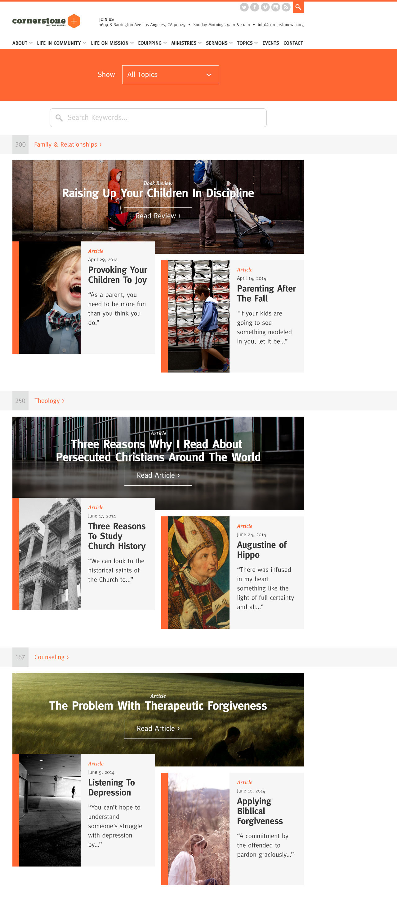
Topics Responsive Layout Breakpoints
Expanding Grid Template
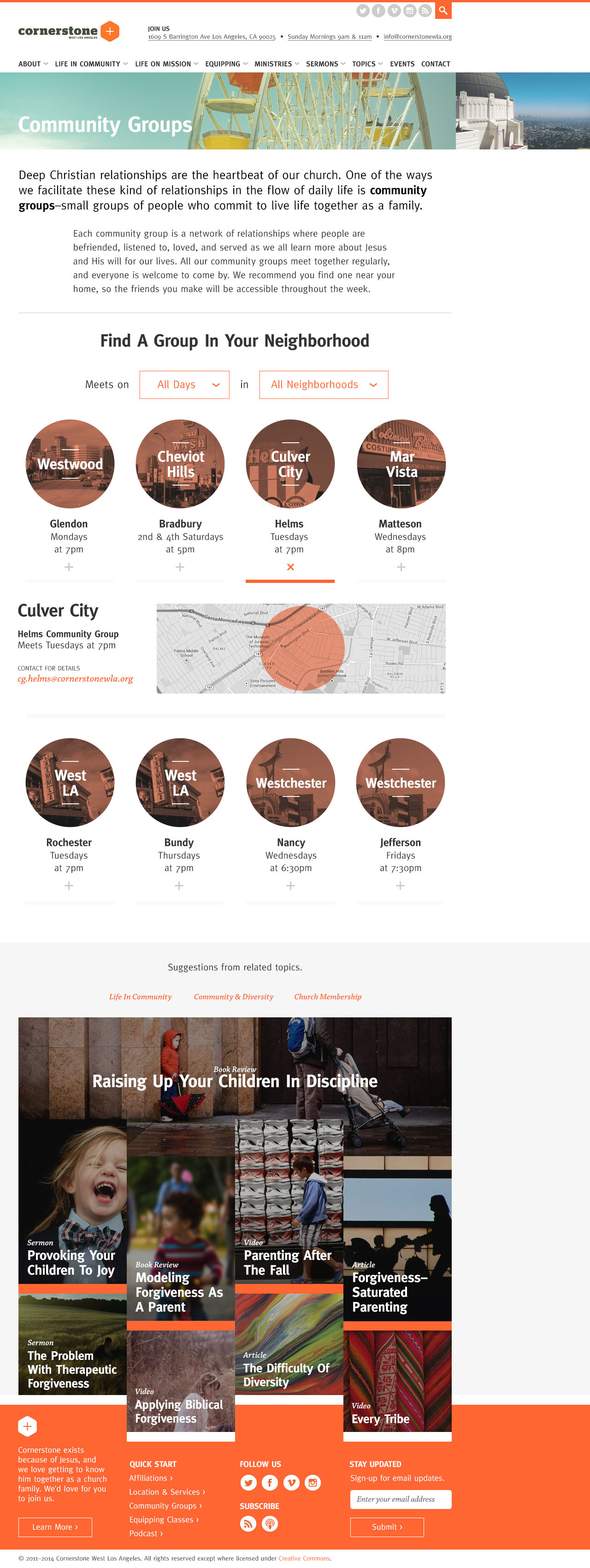
This template was developed for content that should be easily scalable on first read, but provide additional details on click. Below is an example of the template being used to display local community groups. These groups can be filtered by day and/or neighborhoods. A map and contact information are displayed by clicking on an individual group.
Beyond 1280 Breakpoint
A large format layout for screen sizes larger than 1280px encouraging long form reading with quick access to related content and topic categories.