| lapca.org |
My Role:
Art Direction, UX/UI, Design
Art Direction, UX/UI, Design
New. Bold. Here
Located near the site where Los Angeles was founded in 1781, LA Plaza de Cultura y Artes exists to celebrate the enduring and evolving influence of Mexican and Mexican-American culture in Los Angeles and Southern California. The firsts of its kind and located at such a historic location LA Plaza wanted an online experience that made a bold statement, established their presence, and allowed for playful discovery. We developed a set of drivers for them of “New. Bold. Here.” to guide our design explorations.

Colors, Typography, & Inspirations
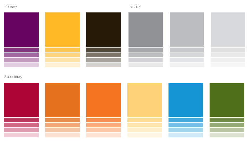
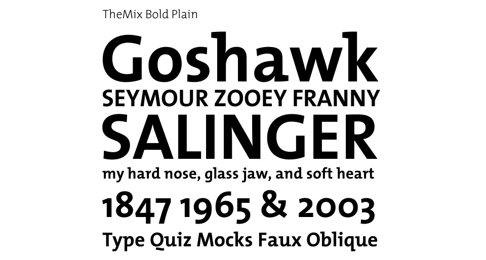
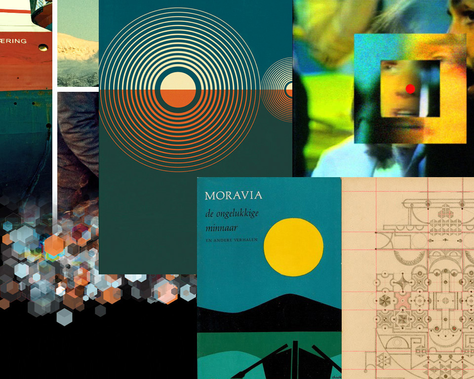
We received the following color, type, and inspiration samples from the client and I was immediately drawn to the vibrant colors, flat aesthetic, and the idea of a schematic type grid system. They had made an excellent choice in TheMix Bold Plain typeface, which contrasted well against a color or image and we were able to license a webfont version.
First Impressions
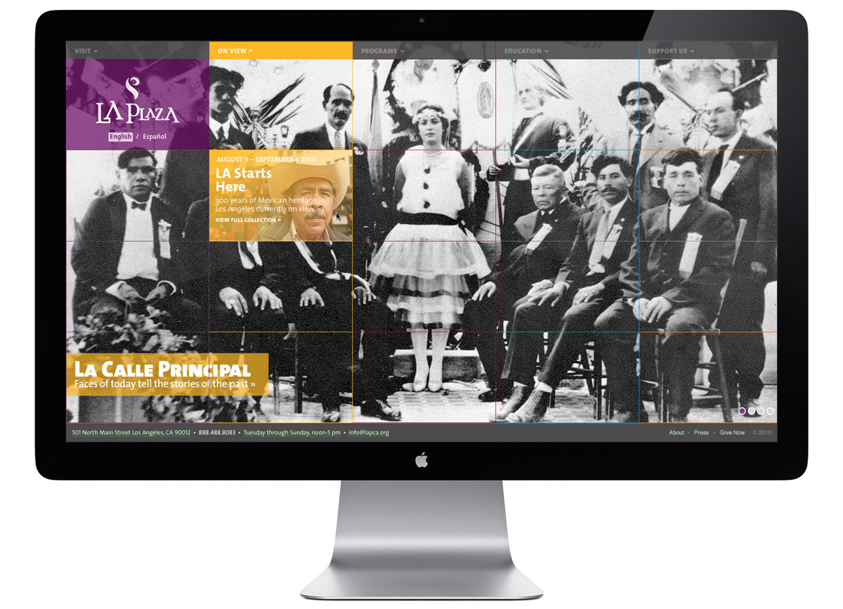
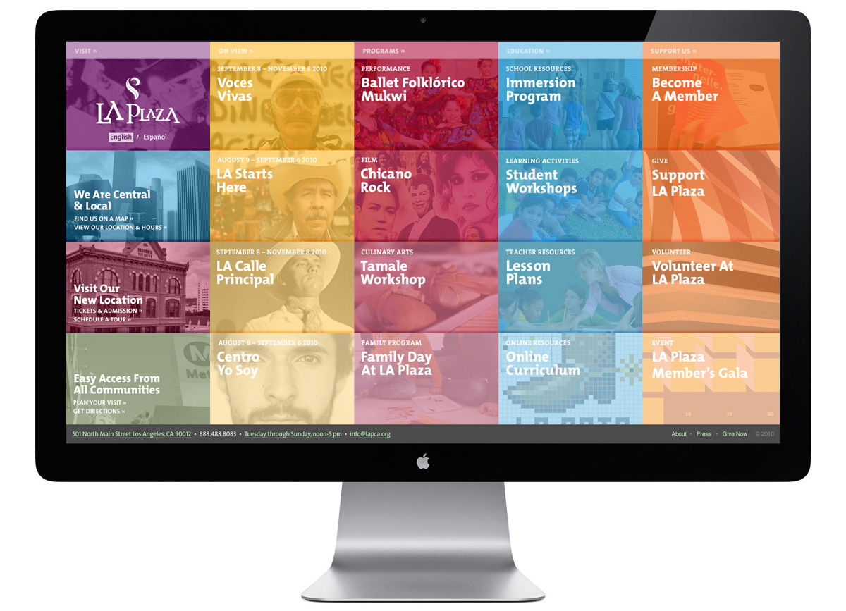
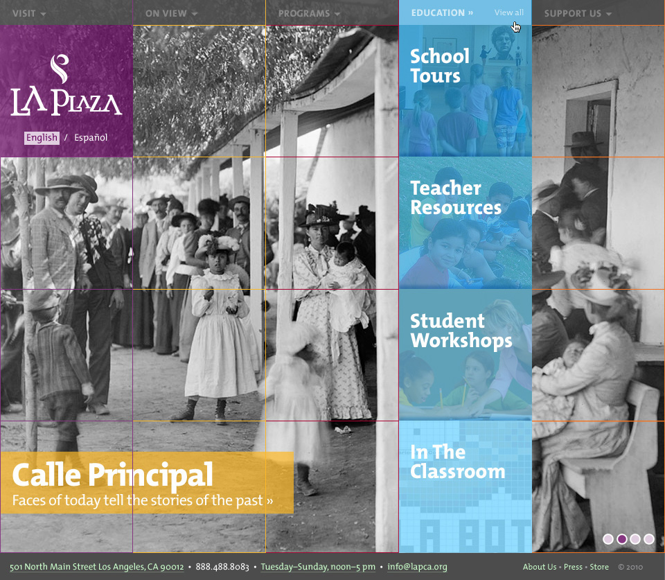
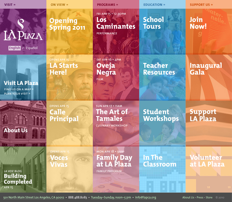
These colors and inspirations lead to a unique design of the site entry allowing for bold photography, focused messaging to engage visitors, and a surprising birds-eye view of upcoming and noted exhibits, events, and educational programming. You could preview a single cell or an entire column and if there ever was a short period of inactivity all cells would be revealed.
English & Spanish Content
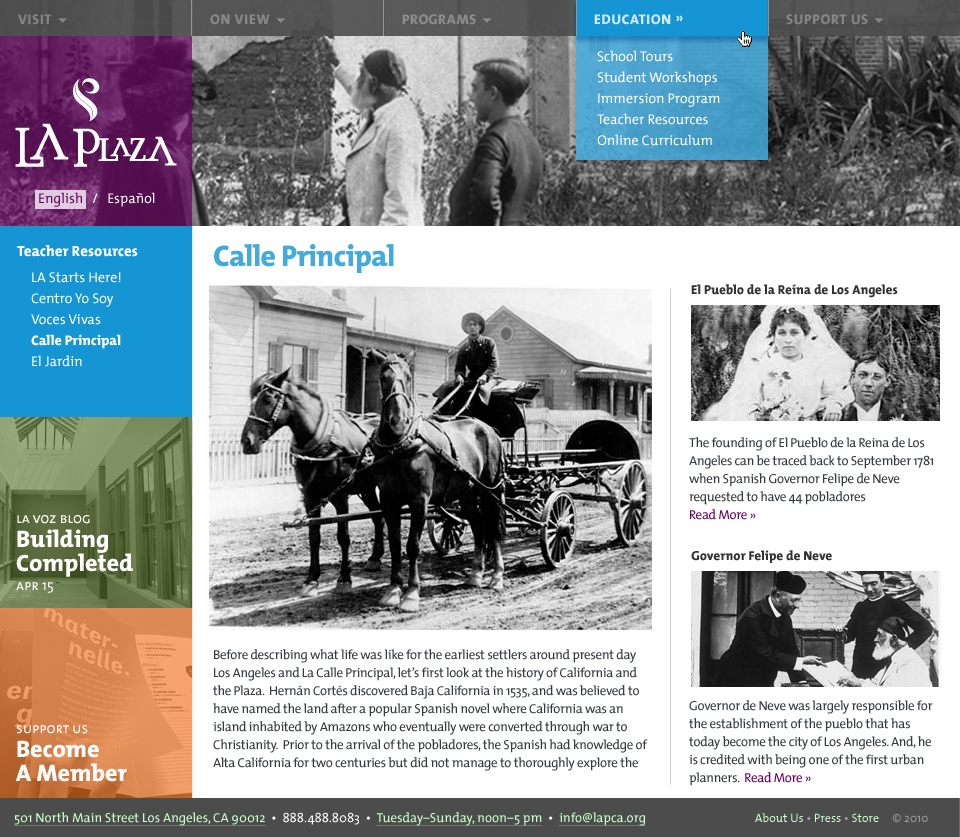
Wanting color to drive a sense of place each top-level navigation item had a corresponding color scheme for the sub-content pages. The grid system was still visible and repurposed when necessary to accommodate various content elements. This allowed for site-wide promotion of an event, exhibit, or featured content piece. A Spanish language version of this site was a requirement and was easily accessible from the toggle under the logo.

Current Exhibitions on View
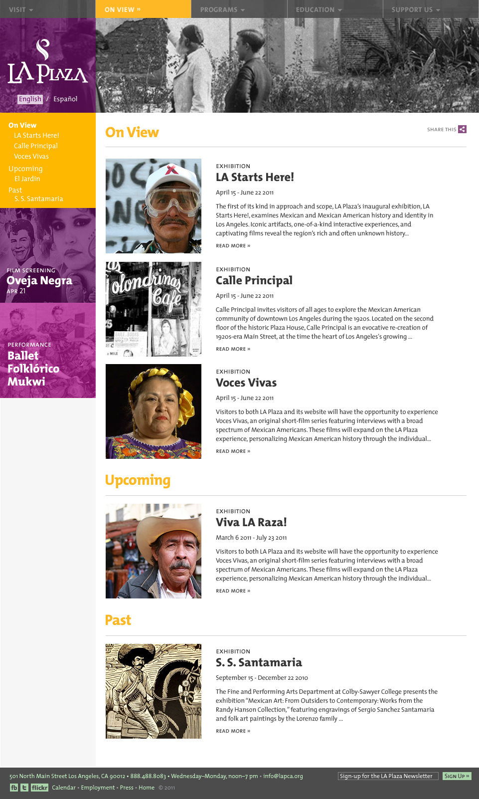
A part of LA Plaza’s public offerings is a dedicated museum and exhibition space. We created a simple page to view currently showing, upcoming, or past exhibitions.
Programs Calendar
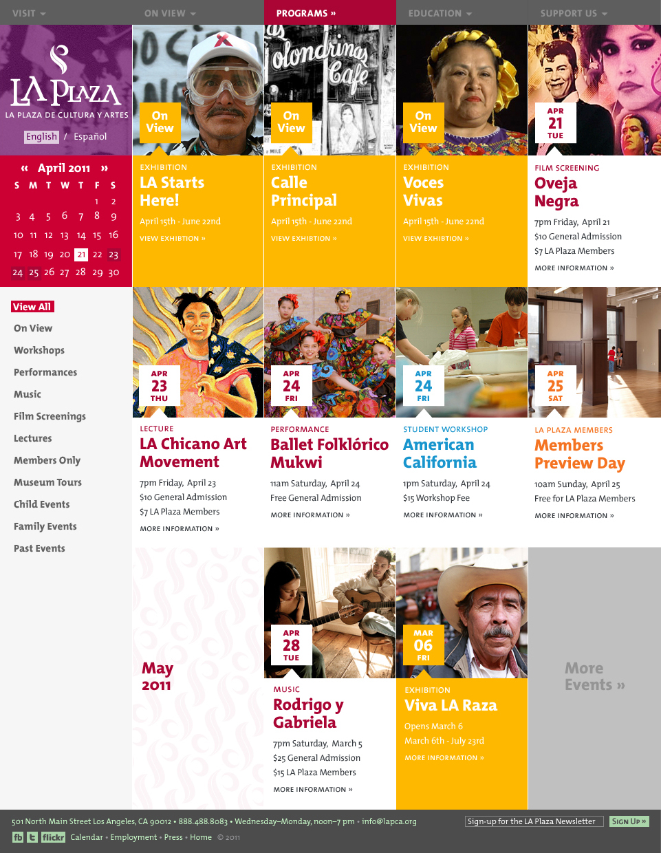
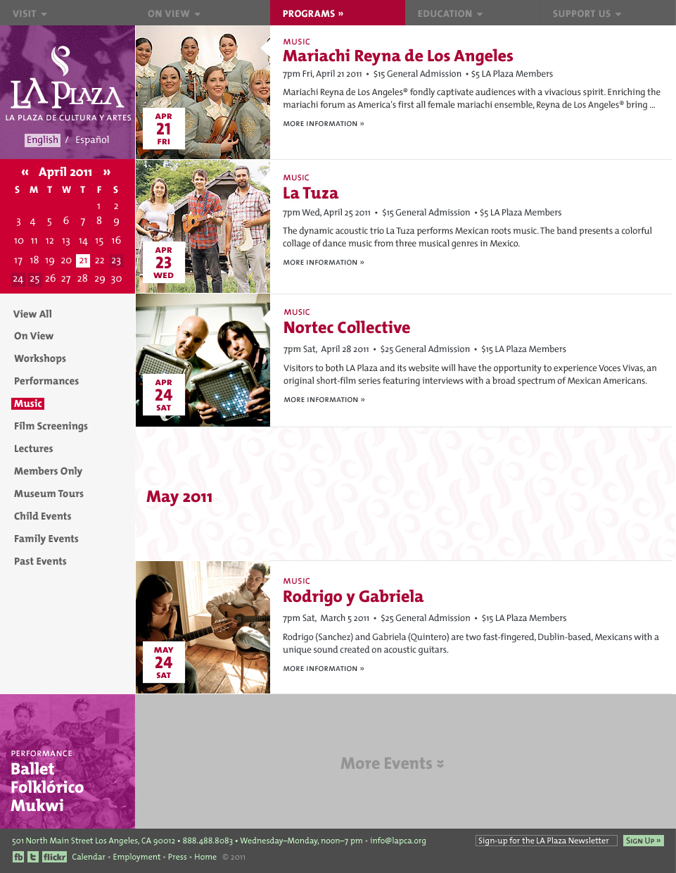
We took advantage of the established grid system and provided a programs calendar with a grid and list view. A user could VIEW ALL programs in a grid view and if they would like to view all programs within a specific category (i.e. MUSIC) they could select their preference and view a refined set in a list view.
Individual Programs Page
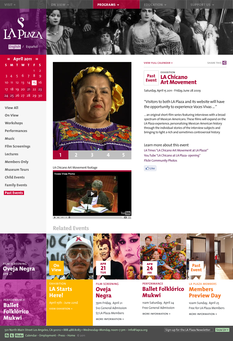
A dedicated programs page to promote events, sell tickets, or act as an archive resource (program videos, news articles, etc) for past programs. A small grid of related events are provided at the bottom to offer additional content.
Email Newsletter
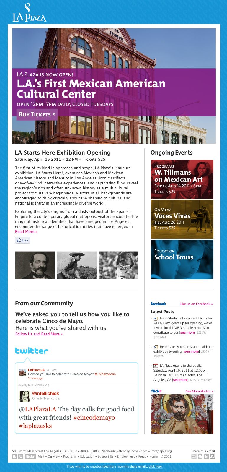
To help carry the LA Plaza aesthetic through to their day-to-day correspondence with their patrons we provided a template to be used with Mailchimp and utilized the social plugins that Mailchimp offered.
